10,000 search results
(0.049 seconds)
- Comedia by Monotype,
$29.99 - Remedy by Emigre,
$59.00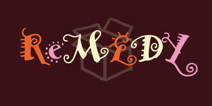
- Cometa by ParaType,
$30.00 An original calligraphic script by Natalya Vasilyeva. Licensed by ParaType in 2003. For use in advertising and display typography.
 - Someri by Arabetics,
$39.00 Someri (English: Sumerian) is an Arabetic type design with a Cuneiform spirit. The Someri family follows the guidelines of the Mutamathil Taqlidi type style. It has one glyph for every basic Arabic Unicode character or letter, as defined in Unicode Standards version 5.1, and one additional, final-position, glyph for each Arabic letter that is normally connected with other letters from both sides in traditional cursive Arabic strings. Someri employs variable x-height values. It includes all required Lam-Alif ligatures and uses ligature substitutions and selected marks positioning but it does not use any other glyph substitutions or forming. Text strings composed using types of this family are non-cursive with stand-alone isolated glyphs. Tatweel (or Kashida) glyph is a zero width space. Keying it before any glyph will display that glyph isolated form. Keying it before Alif Lam Lam Ha will display the Allah ligature. Someri family includes both Arabic and Arabic-Indic numerals; all required diacritic marks, Allah ligature, in addition to all standard English keyboard punctuations and major currency symbols. Fonts are available in regular and italic styles.
 - Someday by MrLetters,
$20.00 Someday is perfect for branding, wedding invitations, magazines, mugs, business cards, quotes, posters, and many more that you can use on your big project to become very beautiful. Someday is equipped with the OpenType feature and has many glyphs. And of course having a lot of glyphs will be able to choose letters to your liking, lots of variations and choices for each letter, so you can customize your design choices and also support other languages. To use a variety of flying machines, you need a program that supports OpenType features such as Adobe Photoshop CS / Adobe Photoshop CC, Adobe Illustrator CS / Adobe Illustrator CC, Adobe Indesign and Corel Draw and many more programs that support OpenType. If you don't have a program that supports OpenType, you can access all the alternate glyphs using Font Book (Mac) or Character Map (Windows) If you have any question, don't hesitate to contact me by email. Thanks and happy designing :-) Thank You for your purchase.
 - Samedi by Scriptorium,
$12.00 - Colegial by Corradine Fonts,
$14.95 - Komedy Kritters - Personal use only

- Bodoni Comedia by Wiescher Design,
$39.50 Bodoni Comedia is for the funny, happy things in life. I really enjoyed doing this one. - your funny type designer Gert Wiescher
 - DS Comedy Cyr - Unknown license

- Wild Comedy JNL by Jeff Levine,
$29.00 John Sigvard ‘Ole’ Olsen and Harold Ogden ‘Chic’ Johnson were musicians-turned-comedians who rose to fame in the zany 1938 Broadway musical review “Hellzapoppin'”. They reprised their roles in the 1941 film adaptation of the show, and the opening title card of the film has “Hellzapoppin'” hand lettered in a tall, condensed sans serif design with an inline. This is now available as Wild Comedy JNL in both regular and oblique versions.
 - Musical Comedy JNL by Jeff Levine,
$29.00 The hand lettered show card brush lettering in the trailer for the 1960 musical comedy “Bells are Ringing” (starring Dean Martin and Judy Holliday) inspired Musical Comedy JNL, which is available in both regular and oblique versions.
 - Silent Comedy JNL by Jeff Levine,
$29.00 A poster for the 1917 Charlie Chaplin comedy “Easy Street” had Chaplin’s name hand lettered in thick, round cornered block characters. This inspired Silent Comedy JNL, which is available in both regular and oblique versions.
 - Screwball Comedy JNL by Jeff Levine,
$29.00 Cary Grant was one of Hollywood’s most versatile actors, playing romantic leads, dramatic parts and showing off his impeccable timing in screwball comedies. A perfect example of this is Frank Capra’s “Arsenic and Old Lace” from 1942. The movie trailer for the film had the title hand lettered in a playful and casual slab serif style, with varying character shapes and weights. This is now available as Screwball Comedy JNL in both regular and oblique versions.
 - Font - Unknown license

- ComFi - Personal use only

- Comet - Unknown license

- Somedeals by Din Studio,
$29.00 Somedeals is a captivating script font that beautifully captures the essence of cursive handwriting with a touch of elegance. This typeface exudes a sense of grace and sophistication, making it perfect for projects that require a refined and stylish look. With its smooth and fluid letterforms, this font offers a natural and seamless writing style, evoking the charm of handwritten notes. The high letter contrast in this font adds a dynamic and eye-catching quality, enhancing the overall visual appeal and making each word stand out. The cursive handwriting style of this font ensures that each letter flows gracefully into the next, creating a harmonious and aesthetically pleasing rhythm. This script font exudes a sense of personality and elegance, adding a distinctive flair to your typography. For the best legibility you can use this font in the bigger text sizes. Enjoy the available features here. Features: Stylistic Sets Ligatures Multilingual Supports PUA Encoded Numerals and Punctuations Somedeals fits in headlines, logos, movie posters, flyers, invitations, greeting cards, branding materials, print media, editorial layouts, headers, and many more. Find out more ways to use this font by taking a look at the font preview. Thanks for purchasing our fonts. Hopefully, you have a great time using our font. Feel free to contact us anytime for further information or when you have trouble with the font. Thanks a lot and happy designing.
 - Romedance by Pen Culture,
$15.00 Please welcome our newest font Romedance. An elegant signature with a beautiful alternate that you can easily combine. it's clean and elegant for logos, brand, wedding invitations, quotes, advertisements, and more. Romedance is equipped with beautiful caps, punctuation, number. this font is also multilingual language. What inside: Follow my shop for upcoming updates including additional glyphs and language support. And Please message me if you want your language included or If there are any features or glyph requests, feel free to send me a message, I would like to update it. Thank you
 - Combi by AVP,
$25.00 The Combi collection includes Sans, Sans Oblique, a true Italic, Serif, Serif Oblique and a set of Openface capitals. Combi fonts have 5 compatible weights and metrics allowing them to be used in free combination. Inspiration came from Jan Van Krimpen’s 'Romulus' (Enschedé, 1931). In addition to the Roman style, Van Krimpen created a set of open capitals, a simple oblique variant and subsequently, an attractive calligraphic italic, Cancelleresca Bastarda. In addition to Van Krimpen’s idea, Combi has been influenced by features from many faces including Bembo, Melior and Optima. The object was to create a versatile family of body text and titling faces for use in books, magazines and on the web. Glyphs are available for most Latin based languages and all text fonts include small caps, proportional numerals and other Opentype features.
 - Samedi Demo - Unknown license

- Comply Slab by Arkitype,
$12.00 Comply Slab is inspired by action and extreme sports, Comply gets it's name from the well known skate trick the “No Comply”. This type family doesn't mess about! With 9 weights from thin to black, Comply Slab will give you some great options to use. This font family will “kill it” in both print and digital, in headlines for editorial, posters, banners, websites, apparel, packaging, logos or magazines just to name a few. If you want to make a statement that gets the message across in a slick way with some cool looking glyphs Comply Slab is the font! There is an alternate R and S so you can choose to go with the cool default sharp glyphs or swap them for a more traditional chamfered corner version. Each of the 9 weights has an italic version to add even more action.
 - TT Cometus by TypeType,
$19.00 Dynamic, attractive and catchy - the new TypeType display font! Please note! If you need OTF versions of the fonts, just email us at commercial@typetype.org TT Cometus is an expressive typeface that captivates from the first time you read a text set in it. Despite its massiveness, the typeface is malleable and dynamic, like a comet piercing the space in order to achieve the only goal - to capture the attention of the viewer. TT Cometus is a slab serif whose strong serifs are serifed at the junctions with the vertical stroke to give the typeface a dynamic and modern character. Thanks to this solution, some elements of the font evoke associations with calligraphic works, while display elements remain stable thanks to massive serifs. The pointed endings of the letters c, y, e, t and noticeable inflows of arches and semi-ovals make the character of TT Cometus dynamic. The contrast between the thicknesses of the horizontal and vertical elements is small, but in the serifs, inflows, and letter endings, the contrast is pronounced. The nature of the font is balanced, and its friendliness is supported by the smoothness of shapes. Oriented towards the viewer, flowing yet massive and dynamic, TT Cometus is suitable for use in eye-catching projects. This is a display font that shows its character better in a large body size and can be used in printed materials or on the web. The font looks flawless in headlines and logos, and is suitable for use in branding. TT Cometus consists of 5 faces: 4 upright and one variable font. Each face has 568 glyphs. The font contains 18 OpenType features, including a large number of ligatures, sets of alternative characters for the ampersand and the letter g.
 - Comenia Sans by Suitcase Type Foundry,
$75.00Comenia Sans was designed in the framework of a unique typographic project for all types of schools. It is a complementary face for Comenia Serif, released by our friends at Storm Type Foundry. Comenia Sans has a lot in common with its serif sister: the height of both upper and lower case, the length of ascenders and descenders, and the general weight. This makes the two perfect partners which work well even when set side by side in a single line of text. Comenia Sans does, however, lack all serifs, ornamental elements and stroke stress variation. All these elements freshen up the feel of long texts, but for shorter texts use, they are not necessary. Despite that, Comenia Sans retains the soft, friendly character of its big sister, as well as a few tiny details which lend it its unique character without compromising legibility or utility. Open counters give all letters an airy feel and permit enough variation in construction. This is why the face works well even in multiple-page texts. All its letters are easily distinguished from each other, so the reader's eyes are not strained. Diacritics and punctuation harmonize with both upper and lower case. As usually, all diacritical marks fully respect conventional shapes of accents and they are perfectly suitable for Czech, Slovak, Polish and other Central European languages, where a lot of diacritics abounds. Similarly to the renaissance italics which refers to the cursive forms, Comenia Sans introduces novel shapes of some characters drawing from the hand-written heritage. This is most apparent in the single-bellied a, the simplified g, and the stem of f which crosses the baseline and ends with a distinct terminal. In the text, emphasized words are thus distinguished not only by the slant of letters, but also by the shapes of the letters themselves. All twelve styles contain set of small caps, suitable for the names, in the indexes or the headlines in longer texts. Legibility in small sizes under 10 points was at the center of designers' attention, too. This is why the counters of a, e and g are large enough to prevent ink spread in small sizes, both on-screen and in print. After all, the font was specifically optimized for screen use: its sober, simple forms are perfectly fit to be displayed on the computer screen and in other low-resolution devices. When used in the context of architecture, the smoothness of all contours stands out, permitting to enlarge the letters almost without limit. A standard at the Suitcase Type Foundry, each style of Comenia Sans boasts a number of ligatures, an automatic replacement of small caps and caps punctuation, a collection of mathematical symbols, and several types of numerals which make it easy to set academic and other texts in an organised, well-arranged way. For the same purpose, fractions may come in handy, too. Apart from the standard emphasis styles, the family also contains six condensed cuts (each set has the same number of characters), designated for situations where space is limited or the need for striking, poster-like effect arises. Comenia Sans is the ideal choice for the setting of magazines, picture books, and navigation systems alike. Its excellent legibility and soft, fine details will be appreciated both in micro-typography and in poster sizes. Although it was designed as a member of a compact system, it will work equally well on its own or in combination with other high-quality typefaces. - Cedi by Typogama,
$25.99 The Cedi Typeface is a single weight display font that is based on the fluid handwritten style of a work colleague. This design is a fast flowing script that is both lively and original yet equally legible due to it's defined letterforms and open forms. Despite working well in a regular format, during the design process I started to look at ligatures as a solution for solving some problematic combinations. However, this small implementation soon got vastly expanded as I started to focus on the rythm of the letterforms and how best to convey the hand drawn feature in the design. A common problem in most script fonts is the repeating letterforms that would be particularily un-natural for this manual typeface, therefore hinting at it's digital source. The ligature concept soon evolved into over 2400 ligatures, trying to cover all repeating glyphs as well as finding more harmious combiations. This design was created for use in short text settings and use at large point sizes suiting titles, screen use or logo designs.
 - Lifetime Font - Personal use only

- Sucker Font - Personal use only

- Charming Font - Unknown license

- HEX Font - Personal use only

- Glitter Font - Unknown license

- #44 Font - Personal use only

- Babylon Font - Unknown license

- barcode font - Unknown license

- moon font - Unknown license

- Dot Font - Unknown license

- Schindler’s Font - Personal use only

- Jacks Font - Unknown license

- Ticky font - Unknown license

- Oblivious font - Unknown license

- Still Font - Unknown license


Page 1 of 250Next page